How To Recover From a Social Media Blunder

You don’t have to go far to find some bad decisions companies have made on social media. (Just look here. Or here.Or even here.)

You also don’t have to let a slip-up avalanche to a mudslide on the reputation you’ve worked so hard to build.

Everyone knows that on the very granular level, every tweet, Facebook status and blog post was written by a person. And people make mistakes: There’s no getting around that.

But people can also learn how to adapt, pick themselves up and recover from said blunder. The only question is how exactly to do that in a medium that’s as viral as the mistakes happening on it.

1. DON’T HIDE FROM YOUR MISTAKES

Google may have a panic button to recall sent emails, but Twitter and Facebook don’t offer such a luxury. Once you update, it’s public domain, no matter how fast you turned around and hit delete, so the worst thing you can do is delete it and pretend like it never happened.

Making a mistake — and we’re not just talking about typos — isn’t the end-all, be-all of a brand; it’s the attempt at hiding these mistakes that really sets the social-sphere in motion. (Here’s looking at you, Anthony Weiner.) If you messed up, fess up. You take ownership of the good things that you do, so there’s no reason you shouldn’t do it for your mistakes.

2. LAUGH IT OFF — WITHIN REASON

If you must delete a rogue update due to company guidelines or pressure from your higher-ups, you still need to own up to your mistake, no matter how embarrassing it may be. This damage control should be more than “We’ve deleted the offensive remark and are looking into the situation.” It lacks sincerity, and your consumers are less likely to trust something that looks like a canned quote.

Remember: Social media isn’t public relations. You can be more candid with your fans.

The Red Cross took this approach when one of its employees sent this personal tweet on the official @RedCross account: “Ryan found two more 4 bottle packs of Dogfish Head’s Midas Touch beer… when we drink we do it right #gettngslizzerd.” Instead of the standard, they decided to have some fun with it with the following response:

Red Cross takes the keys

The result: The #gettngslizzerd hashtag soared, and their evangelists used it to drive blood donations.

3. MAKE IT PERSONAL

If you really dug yourself into a hole, it’s going to take more than an out-of-the-box statement and a few days out of the limelight to make it right.

Apologize, but not to the masses. If you offended some specific people, make the effort to apologize to those people. One. By. One.

Maybe it’s not feasible to respond to all 100,000 people who angrily tweeted to you or posted on your Facebook wall, but for those that made a legitimate effort in saying why they were offend, the least you can do is address them personally.

4. DON’T DO IT AGAIN

People are more forgiving than you may initially think, especially if you’ve been good to them in the past. If you had a solid on and offline reputation before your blunder and took the appropriate steps to mediate the situation after your blunder, then you won’t fall too hard.

But wise up and learn from your mistakes: Friends and followers can forgive you once, but don’t think they’ll be that tolerant the second time around.

What are some of the tactics you would use to get out of a social media snafu?


by Erin Everhart


Strange events in Popular Culture-2

Us Tareyton smokers would rather fight than switch!

wizardoz.jpg

”Us Tareyton smokers would rather fight than switch!" is an advertising
slogan which appeared in magazine, newspaper, and television ads for
Tareyton cigarettes from 1963 until 1981. In America, it was one of the
most recognizable ad campaigns in the 1960s and 1970s. During the
campaign, the models were people from all walks of life and they used
makeup to create "black eyes" to demonstrate their willingness to "fight"
instead of switching from the Tareyton brand.

The first printed advertisement with the slogan appeared in
Life magazine on
October 11, 1963. In 1966, the first television ad with the slogan aired. The
target of the campaign was to create a sense of loyalty amongst Tareyton
smokers. The black makeup that the models and actors used made it seem
as if they had black eyes, probably earned in battles with smokers of other
cigarettes. Due to the success of the advertising campaign, Tareyton brand
briefly enjoyed robust sales, which put them in the Top 10 of all American
cigarette brands during the 1960s and 70s.

Strange events in Popular Culture-1

wizardoz.jpg

elgooG (Google spelled backwards) is the mirror image site of the Google
search engine. elgooG displays the text on all web pages cached by Google
in reverse. The site was originally created for fun, but has gained a following
in China. Because elgooG search terms are printed in reverse, users are
able to perform Google searches without detection by the Chinese
government's search filters.


Visual design students today

Adrian Shaughnessy shares the ten things he thinks you should know about today’s visual design students.

In my roles as an external examiner at a number of universities, and as an occasional lecturer and part-time teacher, I’ve spent most of the past two months in design schools in the UK and Ireland. Like a war correspondent embedded with a front line unit, I’ve witnessed at first hand the attitudes, fears, tastes, prejudices and creative output of a cross section of the current generation of graduating design students.

Adrian Shaughnessy

Adrian Shaughnessy

Here are ten things you should know about today’s visual design students.

1. The good ones are as good as the best from any year you care to choose. In fact, I’d say the standard of top performing UK educated design students is so high that it is hard to distinguish their work from some of the best professional work. Or to put it another way – they’re bloody good.

2. Most design students have abandoned the design fetishism of the past two decades. There is far less emphasis on the stylistic beautification of graphic expression and in its place there is a renewed emphasis on content and returning graphic design to its Modernist roots of form dictated by function.

3. Many of the current generation of students seem to be motivated by social concerns. Where once their energies might have gone into designing CD covers and identities for cultural institutions, it is now commonplace to find students investigating ways in which design can drive social change. For me, this is the biggest single difference between today’s graduates and those from past years.

4. Student graphic designers are increasingly functioning like journalists: this is more noticeable at postgraduate level, but I’ve been struck by the number of undergraduate designers operating like self-publishing reporters. In recent years, an obsession with research for research’s sake has led to lots of dry outcomes, but now there is evidence of designer’s producing original research and then presenting it in a graphically coherent way.

5. It is getting harder to tell the difference between the work of students studying illustration and those studying graphic design.

6. In one school I went to recently, the tiny handful of failures and Thirds would have been top students 15/20 years ago.

7. Few students seem interested in web design. Most admit to being print fixated. This is a worry.

8. Many top students in UK schools are from abroad and many of them are exceptionally talented. What does this mean for UK design? Will they all go home to China, Korea, India and Brazil and join – or set up – world beating studios? Will they go back and teach in schools thus reducing the need for foreign students to come to the UK for an education? Will they stay in the UK and enrich the talent pool? Whatever they choose, foreign students are changing British design for the better.

9. I still hear professional designers and studio bosses complaining that students are not emerging as oven-ready employees. This is often true. Some students have no concept of – or interest in – the professional realm. But it is also true that many are more advanced, forward thinking and future-proofed than the studios demanding graduates with “real world expectations.”

10. A final thought for anyone who scoffs at student experimentation: students are told constantly by their tutors to “be original, be different and don’t copy.” If their attempts to do this sometimes fail, it should not be assumed that they are a lost generation. They are merely doing what generations of students have always done – trying to find what is new, fresh and vibrant. Why else would anyone want to study design?

By Adrian Shaughnessy


Old movie posters

Art & illustration in old movie posters

Published June 24th, 2011 in Coffee Break, Design | No Comments »
movieposter

Since I started up our tumblr account I’ve been looking through a lot more vintage examples of design and illustration. Recently I came across some wonderful examples in the form of classic movie posters. All of these were created the, “old-fashioned” way – by hand. No computer or digital layout. Designers had to be artists. Personally I still think designers should be artists as well and those that aren’t can learn a lot to further their design skills by dipping into the traditional arts now and then, but I digress. On to the posters ….

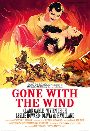
Probably one of the most popular of classic old movies. I love how the fire is such an integral part of this whole design and ties in the large figures with the action below.

Always loved this poster. Simple but effective. Great film too.

This reminds me of old postcards that would have a collage of attractions from the certain area and used bright colors.

I seriously wish I had an original of this one because it’s just that awesome.

When it comes to classic movie posters I am all about the sci-fi and horror genres. They combine creativity with some of the best language about why someone should want to see the film. “Earth given 24 hours to surrender!” I mean, how could you not want to see how that played out? I love how they decided to put the name on there too. It looks like it’s chomping that guy in the front.

Again with the lines … “The greatest terror tale ever told!” I’m partial to anything Vincent Price was in (and hard to go wrong with Poe) as well but I still love what’s going on this poster. Don’t fall of that last step lady!!

Hailed as one of the worst sci-fi/horror movies ever made many might argue that the poster is better than the movie. They have a kind of 50′s space propaganda vibe going on here … with vampires and graveyards. “Unspeakable horrors from outer space.” Whoever did this one was a pretty great illustrator.

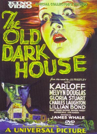
This is what I call the “technicolor-floating-head” style. Seriously, there’s a lot of old horror movie posters like this. I bet they all look awesome under black light.

There was also a whole lot of movies that all claimed to be the, “fear of the year”. The marketing departments must have run out of catchy headlines there for a little bit. I’m pretty sure there’s some actual photography layout going on with this one. It kinda has that cheesy cut-out effect going on. I like the colors.

This is one of the more interesting ones as far as layout goes. It’s like a random rip down the center with the name and text. I like the kid with the fly away hair and of course the dude on the left shielding himself from the incoming terror. The guy with the glasses has to be the scientist in the story. The ladies look petrified. What is up with those lines? For some reason I think it all works though and I love it.

About the author

sherrySherry is the Creative Director at JVM Design. Choosing design as a profession was easy with a heavy background in creative pursuits and an art degree, but Sherry's also been a writer for many years and has had works published in print as well as online. Besides art and design, Sherry also likes comic books, owls, kitsch, sci-fi, archaeology, photography, natural health and many other fun things.


  • digg
  • facebook
  • reddit
  • stumble
  • twitter
  • rss

No related posts.


Why Great Ideas Fail

I ran a session at FOO camp ’11 on Why Great Ideas Fail. It was chaotic, but my goal of leaving the room with a list of reasons was achieved – and here it is.

The crowd was tech and start-up heavy, so the list is shifted towards those pursuits. But this could be the start of a book project that more broadly explores the history of great ideas. Starting with fleshing out these categories better, and then finding good stories that illustrate ideas that failed for these reasons, as well as ideas that successfully overcame these challenges.

Meta-comment: Fascinating how many of these are opposite pairs of each other (e.g. gave up too soon, stayed with same idea for too long).

Follow up: If you were there, or not, and want to be updated if this project gets off the ground, leave a comment.

Why Great Ideas Fail:

  • Killed idea too soon
  • Stayed with idea for too long
  • Death (of person with the idea)
  • Not knowing target audience
  • Not Willing to experiment to find audience
  • Unwilling to change direction
  • Willful ignorance of economics
  • Overcoming organizational inertia
  • Not understanding the ecosystem the idea lives in
  • Inability to learn from microfailure
  • Fighting the last war
  • Giving up
  • Chindogu – solution causes more problems than it solves.
  • Randomness
  • Blamed marketing
  • Failed to pitch or communicate well
  • Not taking the idea far enough
  • Underestimating cultural limits
  • Underestimating dependencies
  • Balancing how world is vs. how world can be
  • Balancing Wants vs needs

Thanks to Val Aurora, I also got a list from attendees of personal reasons great ideas failed. Wide range of levels of specificity, but still interesting,

Specific failures people listed as their own:

  • Forcing something on people they don’t want
  • Not controlling distribution (e.g. Tivo vs. Comcast DVR)
  • Not doing post-mortems
  • Built an Airbnb before Airbnb, but didn’t see it through
  • Not eating our own dogfood
  • Building something ‘powerful’ but too complicate for the average user
  • Voice version of twitter circa 2005
  • Force change earlier. It won’t happen on its own.
  • Launching a product before it’s ready – unreliable performance
  • Not killing a project/startup faster (i.e. spinning wheels for an extra year instead of getting it out the door)
  • Trusting before researching
  • Not trusting my gut
  • Not considering political capital within a large organization
  • Trusting my gut too much
  • Juggling between being your greatest supporter and your greatest critic
story by Scott Berkun


2leep