This logo process post is for
And We Succeed Consultancy, business and management consultancy running within the NHS sector. Alison previously worked for the
NHS Institute;
“The NHS Institute transforms good ideas into workable solutions for an improving NHS.”
Initial Thoughts
This was massively unknown territory for me, consultancy within the NHS is somewhat of a speciality and is certainly not an area I have ever had to deal with before.
To make it even more interesting Alison would be the first independent consultancy specialising in this area which meant we didn’t have any competitors to align up against or to measure our own designs up against. This can have advantages as well as disadvantages. New territory just means you have few constraints and it may just set a sort of visual identity precedent, or you could get it drastically wrong. Thus providing up and coming consultants an opportunity to laugh and design a more appropriate identity.
Alison provided some clear thoughts for the logo and a few these caused me to take notice, so a tactful touch was in order. To some degree I would have to be lead by Alison as she clearly had the experience and knew the sector inside out, she also knew how she wanted to be perceived within the industry.
We had to balance her initial thoughts for logo ideas and her overall experience with anything I could suggest visually: we had to find an agreeable balance.
This was looking to be quite a challenge.
The Brief
The brief was pretty thin, which was understandable given the overall sense of unknown territory. As previously mentioned, Alison did have a few specific requests which were met with some doubt. The main request was that the logo should or feel like the NHS logo.
Alison explained that she wanted to totally shred any visual link between her and the NHS; that AWS was not some off-shoot or NHS approved company.
A few of the visual requests included a jigsaw or jigsaw piece and the colours purple and gold. Although I understood the logic it was now time for me to do my part and explain that slam dunking in a jigsaw piece would be less than agreeable whilst not totally eliminating the idea.
The challenge was to work in some kind of jigsaw link without it screaming “I AM A JIGSAW PIECE”.
Moving onto the suggested colour palette, purple is not a colour that agrees with me, so on a personal level this was quite disturbing–purple has to be used quite carefully, it’s just one of those colours that seems to have very specific associations–and I felt double doom with gold being thrown into the mix.
So this pretty much wrapped up the initial brief.
Review The Competition
Unlike
Brokers Direct that had small army of competitors logos to abuse, to be amused and inspired by AWS was just out there on her own, up against the NHS.
The only logo we could use for direct reference was the actual NHS logo, nothing out there remotely close to what Alison is doing with AWS. Given the explicit instructions from Alison that AWS should not be associated with in any way with the NHS, that about summed up the competition.
Alison did manage to find just two companies that were far far from being remotely close to AWS but were the closest we had. These are those two logos:
And there is that purple and gold .
Phase One – Typography
As is quite often the case, typography takes the initial lead. First I will look in my own extensive font library for any number of fonts that appeal to me, these styles can vary from sensible to rather odd to get an initial feel for the project.
It is nice to start with something so visually accessible. Fonts are just there and you can have a page of suggestions in no time, the logo-mark is a whole other kettle of fish
Starting with font choice is a good first option as it will give you a sense of immediacy and progress at such an early stage.
Alison also seemed to be keen in using the main initials
AWS as the main focus with the full name running underneath
And We Succeed Consulting underneath, something like this.

Not too shabby but the overall impression is of a larger company, not an individual. Also, I don’t care much for using both the initials as well as the full wording,it is unnecessary and add’s clutter
FORMING INITIALS I first looked at how the initials would look, but I immediately felt this was not the route to take. I tried a number of styles, shapes and sizes yet nothing really seemed to work for me. As the NHS logo is based on initials my feeling was that we needed to avoid any similarity with the NHS.

I felt using initials for a consultant lacked warmth and would feel a tad too generic. I really wasn’t convinced and I didn’t spend too much time at this early stage looking at trying to make the initials work.
I did enough to present Alison with a few rough doodles with a decent reasoning of my decision. Using the full name felt more personal and would make people feel more connected with the company name. Given this was a brand new company and also a first within the sector, overall familiarity with the full brand-name is crucial
With a new company you want to be associated with the full name, not your initials.
Often larger brands and companies will shorten to initials if consumers themselves have taken to referring to them by initials. Sometimes a mass consumer voice can weald extraordinary power and sway.
So the AWS initials were out.
These are just a few of the font styles I looked at and included both serif and sans-serif styles. At this early stage my gut was leaning towards serif for the main logo wording. It seemed to fit with what Alison and I had discussed but also because it was a clear move away from the sans-serif of the NHS logo.
The challenge was making sure the logo didn’t look too stuffy, old or traditional which some serif fonts would give you.
At this point I needed to consider how to balance up the main serif wording with a sans-serif element; to inject some freshness in and to dilute any risk of fuddyduddyitus.
This is where talking to your client on the phone becomes invaluable, I still know of many designers who practically refuse to use the phone and talk direct with a client. Some times when trying to understand a client explain a particular thought, emotion or idea cannot effectively be done over email.
Although Alison asked for
And We Succeed Consulting as one line I felt that this presented several problems, overall line length being one. The sans-serif version doesn’t look too bad on it’s own, but we need to factor in a logo-mark at some point. The serif version just looks and feels a bit
meh, for want of a better word.

Long line logos can work, but you need to be aware of how the logo will fit in within the identity as a whole and how it will be applied. For this project I was looking to create something a less wide and so was aiming to split it over two lines.
TIP – Just throw down a bunch of font choices on your pasteboard but try not to think too hard at this stage. When you have exhaustive your own personal collection of fonts then it’s time to move to the web.
My first port of call is MyFonts.com: it’s the most accessible and varied collection of fonts from some of the best and least known type foundries and designers. I can spend days onMyfonts and I will bookmark any fonts that feel close. Once I have exhausted MyFonts I then head off to the individual font foundry websites as not all fonts are cataloged with MyFonts.
The exercise is to feel you have looked at and exhausted the range of font choices, only then can you say you really did try to find that special one font.
So now I had decided that the wording would be split, I then mocked-up some rough examples to get an initial feel for size, position and overall look and feel. The image below borrows some of the fonts shown above but I have created lowercase and uppercase versions for comparison.
Although I was leaning towards a serif for the main wording I still wanted to see how it would look with a sans-serif on the first line and serif as the secondary line.
There are many variations and combinations when using serif and sans-serif together like this so you need to take your time and look at as many combinations as you can. What you see above is just a small part of the tests I carried out and did takesome days to work through.
TIP : Your eyes will need a break if you are repeatedly focusing on repeat text blocks like this, so try and factor in a day or so break from that job, it does help. As with anything that you stare at for long enough, judgment can be significantly impaired. A font combination that you are convinced looks crap after a 12hour stint could look much better the day after.
Font pairings can be tricky to get right so take your time.
At this point I took a break from the whole font thing and threw some energy into the logo-mark. Having a reasonable idea of the overall style and shape of the wording, I now needed to see how this would look with a logo-mark.
Phase Two – Logo
This part is always tricky and potentially the most time consuming and nerve shattering. I had my goalposts as requested by Alison, the jigsaw part of her brief needed to be visualised in a way that was subtle.
Because I have taken my sweet time to get this logo process together, I have unfortunately lost track of my initial sketches which is a shame.
I do tend to keep a detailed record of the process on my Illustrator pasteboard, I always keeps copies of each graphical element I am working on. Each time I make a change or alter a portion of an icon, I will duplicate it and work on the the new copy. This leaves the original intact just in case I need to revert back or like this, have a detailed version history of each small change made.
Start at the very beginning. I required a jigsaw, so that’s what I drew.
Here we have four various shapes of jigsaw and to be honest, I was excited even at this stage because in my head these would look pretty solid next to some well chosen type. When I looked at each one of these I felt that the overall solution was not so far away.
The first thing to do was the lay one of these alongside the wording, just for an initial impression.

The logo was already evolving and I felt pretty sure this would be close to the overall shape. Clearly I was not going to slap in a whole jigsaw piece but it did get the mental motors churning. I played with some sketches based around the jigsaw piece and liked how the 4-sided piece looked as a whole.

Inspiration can come from anywhere: one of my stress toys is this little blue desk spinner. Whilst pondering the jigsaw I saw the spinner and the pieces–pun kinda intended–started to fall together. I doodled with this rounder knobbled look to see if we could alter the jigsaw enough for ut not to clearly be a jigsaw.

The rounded design didn’t quite work for me, reminded me too much of some Knights emblem but it was a useful exercise as this spurned a few more thoughts and ideas. I realised that the logo-mark would probably end up in a container of some kind and given the overall shape of the icon so far, a circle seemed favorite. Putting the icon into a circle then lead to a few other ideas.
Looking at these early visuals, especially the latest versions within the circle, I was visualising a compass and wondered if this would also tie itself in to what Alison represented.
I considered the brief again and took it upon myself to agree with myself.
Yup, we could definitely angle in a compass association to Alison’s line of work. She provides solid direction for companies, helping them find their feet and setting them off in pursuit of riches and stuff. So now we had a compass and jigsaw that could be factored into the overall design.
This was ideal because it helped dilute the jigsaw link which made me feel happier. I took a quick look at some compass examples on various stock sites to see if there was a particular angle I could work on. I liked the clean lines, the simple representation with white dots of the first icon and felt that something along these lines would integrate awesomely with my jigsaw piece.
Now we’re getting somewhere.
Useful to note that I had yet to show Alison anything, so I was going a bit out on a limb. I did decide to call her around this time to give her a verbal update and talk to her about the compass and jigsaw integration; the response was very positive.
With this update, I felt it would be more productive to work on presenting a solid and near complete design rather than a loose sketch or mock-up. So with this news I proceeded in earnest, I was feeling particularly pleased with how everything was moving along, far better than I had first imagined when I first heard the words jigsaw piece.
I think this goes to show that starting from an obvious image like a plain old jigsaw can lead to more interesting concepts. Like I preached, start at the beginning even when it feels foolish and cheesy to do so. Ideas have a habit of forming when looking at the obvious and expected.
Taking the lead from that stock compass icon, I played with some simple variations above. Adding small dots or shapes to reflect the inner parts of a compass. Just these four little details changed the overall jigsaw considerable, which was just what I was hoping for.
This shows the progression from a rounded jigsaw to the more pointy or arrow style at the end. A further gift from the compass and yet again helping create a more unique icon.
When Alison first saw the idea she instantly remarked how the logo-mark also resembled a top down view of a table with 4 people sitting around it. This fitted in nicely with what she does with AWS, sitting round tables talking to clients about stuff and stuff.
So flukey bonus points to me for that one.
Just To Say
Although this sounds reasonably straightforward and logical when you read it, I have had to miss out quite a lot of boring and repeatitive stuff in this post.
Trying to keep the balance between relevant and interesting whilst trying to show the smaller details that actually contribute to the final design. There is a heck of a lot of backwards and forwards with a project like this, playing with infinitely small changes and variations. It’s these details that can make all the difference but also take up a lot of time.
This is why I rarely take on a project that is needed quickly. I like to play the detail devil and this means knowing the schedule is flexible enough to tollerate all my dillying and dallying.So back to the project.
Phase Three – Combine Words & Graphic
Whilst playing with the compass I had also been tinkering with the typography again and had made a few selections, narrowing down the options to just a few. I had decided to go with serif on top with sans-serif falling on the 2nd line and justified to the left. I was looking for a particular style of serif font that looked well proportioned and relatively compact in upper case.
Many serif fonts have small x-heights and can be reasonably thin in proportion so this narrowed down my selections quite a bit.
You can see from the example above how the blue font FoundryWilsonExpert looks and feels much more compact than the black coloured Eldorado Display sitting underneath. A lot of this is just a personal preference with serif fonts, I just much prefer them to be more compact looking, they feel better proportioned but also have a less rustic feel than the “taller” variations
This is where the joy of font-pairing hits you hard and fast.
Phase Four – Font Pairing
Prior to making my mind up with the serif selection, I had earlier decided to use font like
Gotham for the 2nd line–if you are looking for some
Gotham alternatives, I might just have a few for you–which falls into this more compact and well proportioned shape.
Looking at the image above again you can see how the first serif example when paired withGotham looks a little unwieldy and lanky. The proportions feel way off and also now looks a little top heavy, even though Eldorado is a relatively light font.
Compare this to the right hand version where I have paired FoundryWilsonExpert withGotham, this looks more like a natural fit. Foundry does not look out of place and seems to sit comfortably on top of Gotham; this is because the fonts share similar cap-heights.
TIP: An easier way to see this in action is to put both serif and sans-serif on one line. Eldorado and Gotham on the top and FoundryWilsonExpert and Gotham on the bottom.
With consultancy the same point-size and ensuring the serif cap-height matches the cap-height of Gotham, you can see exactly how much narrower Eldorado is when viewed in this way.
TIP: Another visual clue is to look at the overall shape of the letter O and see how it varies with your suggested font-pairs.
The horizontal guides represent the cap-height whilst the the Gotham O is blue with the serif overlayed. FoundryWilsonExpert on the right is much closer in style than Eldorado will ever be.
Bye bye Eldorado.
Phase Five – Colours & Details
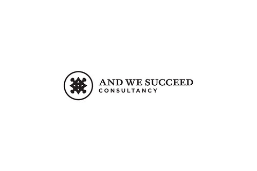
Taking ALL the above into account, this is what we end up with.
A jigsaw forms the core shape whilst the compass provides some extra clues to what AWS is all about. Details like rotating the icon 45˚ creates a more interesting shape and allows the rounded jigsaw bits to fall either side of the more pointy compass like arrow corners. Some of this was just about shifting focus away from the jigsaw piece. The white specs are little mini-triangles to provide some visual interest to the centre.
Finer details had to be thrashed out over a few days, which included: how thick or thin to make the circle key-line, how much space the icon should take up within the circle, how big the wording should be in relation to the whole logo-mark, how much space to leave between the two elements, how much tracking to apply to the tag-line which would determine how big or small the point size should be in relation to the main wording.
Phew.
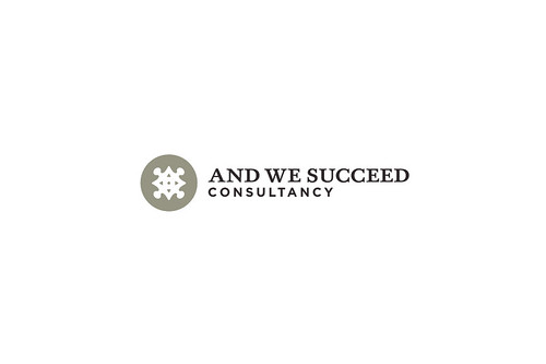
Then we had colour. I’ll touch on this quickly as this was not so quick to sort out. I really didn’t see purple fitting in with this logo although I did show Alison a number of colour options.

Bright purple was out of the running but we still couldn’t really decide on a suitable colour.
The idea was that this would be a 2-colour job, black wording and the something colour for the logo-mark. Alison quite quickly discounted the brighter colours as these just didn’t work with the overall style of the logo, so we ended up with more muted options.
Now this is where it’s always important to keep what the client has or had suggested in mind, no matter how obscene it might have sounded at the time. At the beginning Alison had suggested purple and gold and I had quickly discounted the gold as the mental image of this bright yellow hue was way too hideous.

Looking through my Pantone swatch book I flicked right to the back and saw a few pages of metallic colours, including gold. Never before had I considered a metallic for such a prominent area, let alone gold. Yet the colours staring at me were beautiful and I was coming round to the idea of actually using gold, just not quite the gold Alison had in mind at the beginning.
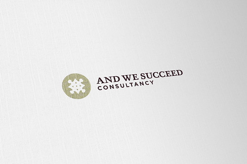
We narrowed down the metallic options to Pantone 8003C.
What a result. The client ends up with both her initial requests: the jigsaw piece and the colour gold, bundled into the finished design.
With final artwork approved for the logo I just had to knock-up some business cards for which I was terribly excited about this because it meant fully utilising Pantone 8003C.

The chosen design has an all-over tint of Pantone 8003C on the front with the logo-mark dead centre. So with one colour we were able to create the impression of something a little more interesting, especially with the white out portion of the logo-mark as the main focus.
The reverse is a pretty standard layout, nice and clean.
As I had used Gotham in the logo for the secondary line it made sense to keep this as the main secondary font for the overall identity.
My master plan was hoping that when printed on super white stock that this would really set off the logo-mark.
The result was better than I had hoped. As you can see from the images below, in certain lights the metallic gold reflects the light with its subtle sheen.
You made it.
The End.
source: http://imjustcreative.com/logo-process-aws-consultancy-logo-design/2011/04/01/


.jpg)
.jpg)
