If you are a complete beginner looking for logo design tutorials you probably have found a few different blog posts on the logo design process and even a few walk through tutorials showing the start and finish point of logo design. This is all very well but if you are anything like I was when I first started learning graphic design (years and years ago) it’s all a bit overwhelming. One of the things that could help you is to break down the logo design process into small exercises where you don’t feel pressured and you don’t have to show anyone (including a client) your logo design results.
Here’s one logo design tutorial exercise which could start your mind thinking more in the way a designer does when they are working on logo designs.
Logo Design Tutorial Exercise 1
1. Start by thinking of a couple of words, ideally that are the opposite or very different from each otherFor example Dog and Cat or Devil and Angel
2. Quickly brainstorm each word – using mind mapping techniques.
You can do this by starting with your word written in the middle of the page and then spring off of that other related words. So in the case of the word Angel, I might have wings, halo harp etc etc. If you prefer you can use mind mapping software to do a similar exercise. You can also try other creative techniques to generate more ideas.

3. Take these two words and sketch them very basically on a piece of paper or type them in on the computer if you prefer
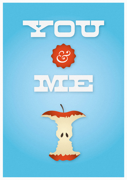
4. Now by adding just one or two shapes or lines make these words have some resemblance or association to what they are.
These do not need to be polished, they can just be very rough and sketchy as mine are below

5. Repeat the exercise above to see how many options you can create. As a slight variance try to use just the first letter of the words in the same way.
6. Take your favourite logo options, scan them into your computer and have a go at working them up using a vector program such as illustrator
If you are looking for free vector software try Inkscape.
Don’t worry about using fancy typefaces, just use something basic for now like Arial or Helvetica. This gives you less to worry about and allows you to concentrate on the shapes. When you get more experienced you can experiment with fonts but keep it simple for now and concentrate on one thing at a time. Start in black and white and only when you are completely happy you can choose then to use one or two colours.

http://www.graphicdesignblog.co.uk/logo-design-tutorial-exercise-1-for-complete-beginners/

