Art & illustration in old movie posters

Since I started up our tumblr account I’ve been looking through a lot more vintage examples of design and illustration. Recently I came across some wonderful examples in the form of classic movie posters. All of these were created the, “old-fashioned” way – by hand. No computer or digital layout. Designers had to be artists. Personally I still think designers should be artists as well and those that aren’t can learn a lot to further their design skills by dipping into the traditional arts now and then, but I digress. On to the posters ….

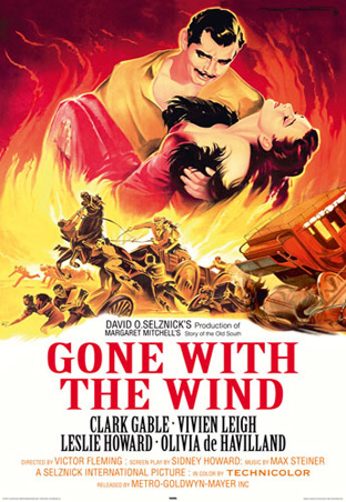
Probably one of the most popular of classic old movies. I love how the fire is such an integral part of this whole design and ties in the large figures with the action below.

Always loved this poster. Simple but effective. Great film too.

This reminds me of old postcards that would have a collage of attractions from the certain area and used bright colors.

I seriously wish I had an original of this one because it’s just that awesome.

When it comes to classic movie posters I am all about the sci-fi and horror genres. They combine creativity with some of the best language about why someone should want to see the film. “Earth given 24 hours to surrender!” I mean, how could you not want to see how that played out? I love how they decided to put the name on there too. It looks like it’s chomping that guy in the front.

Again with the lines … “The greatest terror tale ever told!” I’m partial to anything Vincent Price was in (and hard to go wrong with Poe) as well but I still love what’s going on this poster. Don’t fall of that last step lady!!

Hailed as one of the worst sci-fi/horror movies ever made many might argue that the poster is better than the movie. They have a kind of 50′s space propaganda vibe going on here … with vampires and graveyards. “Unspeakable horrors from outer space.” Whoever did this one was a pretty great illustrator.
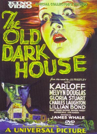
This is what I call the “technicolor-floating-head” style. Seriously, there’s a lot of old horror movie posters like this. I bet they all look awesome under black light.

There was also a whole lot of movies that all claimed to be the, “fear of the year”. The marketing departments must have run out of catchy headlines there for a little bit. I’m pretty sure there’s some actual photography layout going on with this one. It kinda has that cheesy cut-out effect going on. I like the colors.

This is one of the more interesting ones as far as layout goes. It’s like a random rip down the center with the name and text. I like the kid with the fly away hair and of course the dude on the left shielding himself from the incoming terror. The guy with the glasses has to be the scientist in the story. The ladies look petrified. What is up with those lines? For some reason I think it all works though and I love it.
No related posts.


 Sherry is the Creative Director at JVM Design. Choosing design as a profession was easy with a heavy background in creative pursuits and an art degree, but Sherry's also been a writer for many years and has had works published in print as well as online. Besides art and design, Sherry also likes comic books, owls, kitsch, sci-fi, archaeology, photography, natural health and many other fun things.


Hey, I am highly impressed to see the massive art and illustration in those movie posters. As they are really looking vintage collection of movie posters. But they are greatly looking fantastic and heart throbbing yet. Thanks for sharing some magnificent old movie posters in this post.
YanıtlaSil