Choosing an appropriate font for a design is very important. Like sounds, I believe that fonts have timbre. They can be described as having intangible properties that normally wouldn’t be associated with type such as being dark, violent, happy, sad, rugged or loud. With that in mind, a design will benefit by choosing fonts which possess the appropriate timbre or tone and will help set the mood the overall design is meant to convey.
The First Step to Choosing the Right Font
Once the idea is established, a designer will need to understand how that idea needs to be conveyed. A few points will have to be established in order to do this:
- Who is the target audience?
- What is the idea?
- Where will the design be?
These are just a few of the questions, but much will need to be determined. Sticking with the standard who, what, when, where and why will be the simplest way to deduce the how.
Excellent Font Inspiration – Movie Posters
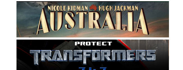
One of the best examples of both appropriate and inappropriate typefaces would be movie posters. Movie posters need to grab attention and convey the timbre and idea of the movie very quickly. The posters will also have to be aesthetically pleasing at the same time. Since the movie itself already is the idea that needs to be conveyed, the imagery and timbre are already set. The layout and fonts are what need to be established. The design just has to focus around has already been established.
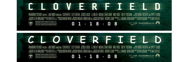
The “Cloverfield” poster has fonts that are similar to one you would find in a case report. It supports the idea that there is a mystery or something can be classified. The colors and blur on the text make it foreboding and also give the idea that this is science fiction and could be frightening. After we switch the font to Comic Sans, it turns into the box for a breakfast cereal; presumably one that is full of mystery.
Typeface Lost and Found
Understanding the project and a clear statement is what is needed in choosing the correct typeface. Once determined, the designer will be able to feel what would be right. The typeface is chosen before the search begins.


Hiç yorum yok:
Yorum Gönder